By mumu
There’s a difference between a collection of pots and a container garden display. The first is what most people have — a few plants here and there, each chosen independently, without much thought to how they work together. The second is what you’re aiming for — a cohesive, intentional arrangement that looks designed rather than accumulated.
The good news is that creating a truly stunning container display doesn’t require expensive plants or professional design skills. It requires understanding a few key principles and applying them consistently. Here’s how.
The Thriller-Filler-Spiller Formula
This is the most reliable framework for creating beautiful mixed container displays, and it works consistently across seasons, styles, and plant types.
Thriller: A tall, dramatic plant that provides height and draws the eye — the centerpiece of the arrangement. Examples: tall grasses, dahlias, upright rosemary, cordyline, salvias, or tall snapdragons.
Filler: Medium-height, bushy plants that fill in around the thriller and give the container a full, lush look. Examples: petunias, marigolds, geraniums, impatiens, compact herbs.
Spiller: Trailing plants that cascade over the edge of the container, softening the hard line of the pot rim and creating a sense of abundance. Examples: ivy, calibrachoa, sweet potato vine, lobelia, bacopa.
One thriller, two or three fillers, one spiller — planted in a container large enough to accommodate them — produces a display that looks professionally designed with minimal effort.
Think in Groups, Not Individual Pots
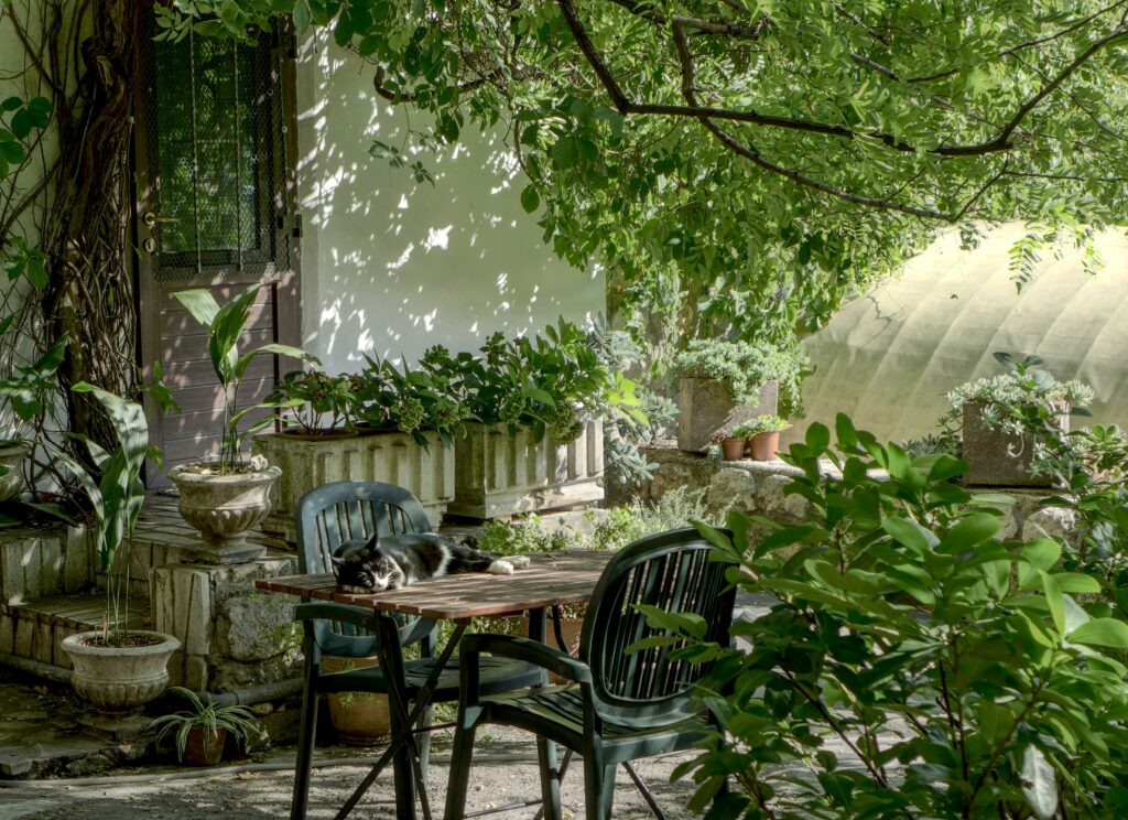
Single containers placed randomly around a patio rarely look as good as a thoughtfully grouped arrangement. Grouping containers creates visual mass, a sense of cohesion, and a more humid microclimate that benefits the plants.
When grouping containers:
- Use odd numbers — Groups of 3, 5, or 7 look more natural and interesting than even-numbered groups
- Vary the heights — Mix tall containers with medium and low ones to create a layered effect
- Use different sizes but consistent style — Matching materials or colors ties different-sized containers together
- Leave a focal point — One container in the group should be larger or more dramatic than the others, anchoring the arrangement
Color Coordination
Color is where container displays either come together beautifully or fall apart. A few approaches that consistently work:
Monochromatic: All white, all purple, or all yellow flowers in different textures and heights. Simple, elegant, and almost impossible to get wrong. White flowers in particular look stunning at dusk and into the evening.
Complementary colors: Colors opposite on the color wheel — purple and yellow, orange and blue, red and green. High contrast and energetic — great for sunny, visible spots.
Analogous colors: Colors that sit next to each other on the color wheel — yellow, orange, and red; blue, purple, and pink. Harmonious and pleasing — slightly less dramatic than complementary but easier to work with.
Whatever palette you choose, limit yourself to 2–3 colors per display. More than that tends to look chaotic rather than abundant.
Use Containers as Part of the Design
The containers themselves are part of the display. A beautiful plant in a mismatched or inappropriate pot is less impactful than the same plant in a container that complements it.
- Classic terracotta works with almost any plant style — it has a warmth and naturalism that suits both formal and cottage-style displays
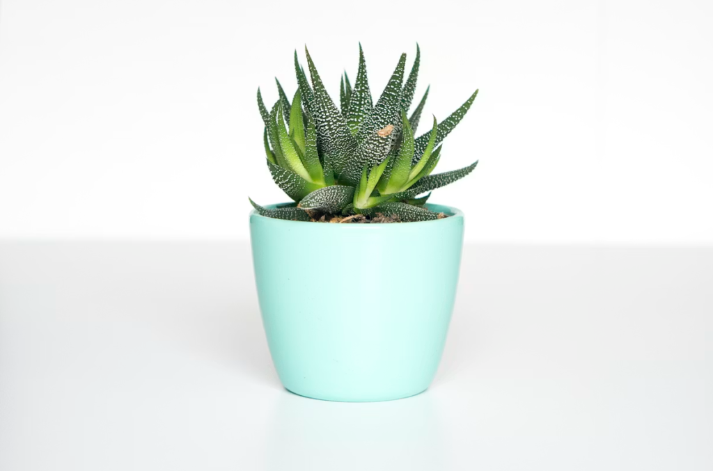
- Glazed ceramic in a strong color makes a statement — the container becomes a design element in itself
- Matching containers in a group creates cohesion — a set of identical pots in different sizes planted consistently looks intentional and polished
- Avoid using too many different container materials and colors in a small space — it looks busy rather than curated
Texture and Foliage Matter as Much as Flowers
Beginners often focus entirely on flowers when choosing plants for a display — but foliage and texture are what keep a container looking interesting when flowers aren’t at their peak.
Include plants with interesting foliage: the silver of dusty miller, the burgundy of heuchera, the bold architecture of ornamental grasses, the fine texture of asparagus fern. These plants provide contrast and visual interest that flowers alone can’t sustain through the whole season.
Practical Display Tips
- Deadhead regularly — spent flowers make a display look tired and past its best; removing them keeps everything looking fresh
- Water consistently — a wilted plant in a display looks dramatic in the wrong way
- Edit ruthlessly — if a plant isn’t performing or doesn’t fit the display, remove it and replace it
- Add lighting — solar fairy lights or LED spotlights transform a container display in the evening and extend its enjoyment into the night
Final Thoughts
A stunning container garden display is really just the result of a few intentional decisions applied consistently — the right combination formula, thoughtful grouping, a coordinated color palette, and attention to foliage as well as flowers.
Start with one focal container using the thriller-filler-spiller formula, build a coordinated group around it, and maintain it well. The difference between that and a random collection of pots is genuinely dramatic. 🌸
Questions about creating a beautiful container garden display? Visit the Contact page!
— mumu, Green Garden Tips